Trangender dating profiles
Empowering users with full controlProfile pages within dating sites and apps are very personal to their owners. It's a chance to share with the community, details that describe interests as well as identity definitions. For example, a profile on a ‘standard’ dating site would include, gender, sexual orientation and age.
Many sites give their members the gender options of male or female, others have adopted male, female and non-binary. More recently, dating brands have included an increased range of non-binary definitions, this can be in excess of 30 selections. However, this degree of granularity is often not sufficient.
Butterfly, the transgender person first dating app continually solicits feedback from its members and its gender selections received two complaints. The first being that there were too many options, the second, too few. The challenge was to design a solution that would satisfy both of these conditions.
Forced to pick incorrect options
This is genuine site feedback from a member named 'R'``I'd tried various dating sites in the past, but found them all to be rather unsatisfactory; mainstream ones catered poorly for LGBT+ people in general, whilst some LGBT+ were not necessarily any better for trans and intersex people. Trans-specific ones were the worst, fetishising trans people, and frequently disrespectful of the community. When I heard about Butterfly, via an LGBT+ news channel, I thought I'd take a look. It promised to be different, so I set up an account and had a look. There were plenty of matches who weren't hundreds (or even thousands) of miles away, so that was an improvement on some, and it definitely seemed geared up for trans people who might be seeking a serious relationship, rather than just the casual hook-up (though doubtless you could find that if that's your thing, too).
The thing I didn't like was how the site defined me. I was born intersex, raised as a boy, but suffered from gender dysphoria as a result. Some might argue I'm not technically trans, but my experience is surely similar to that of a trans person. I'm a woman; if it requires qualification I'm a woman with an intersex or trans history, but it's seldom necessary. When choosing how to define myself on Butterfly, choosing female automatically defined me as cisgender. If I defined myself as intersex, or trans, it ascribed me a different gender marker from the Venus symbol with which I associate. Small things, perhaps, but it left me feeling uncomfortable. Normally I'd just have deleted my profile and moved on, but I thought whoever was behind Butterfly had tried really hard to get it right, so decided to offer some unsolicited feedback. Although I didn't expect a response David got back to me within the hour, opened a dialogue, and seemed genuinely concerned. I felt if anyone is that responsive and open to developing their product they deserve supporting. A few emails later and David had addressed all my concerns; it's just amazing how keen he has been to get this right. Thank you David!``
How to solve R's concern
If R wanted to use Butterfly she would have to use a profile that she felt uncomfortable with or be forced into selecting an incorrect gender description, either option would not be acceptable.Adding more gender options would have been difficult as it would cause issues for other members searching for potential matches, with too many options people could potentially miss someone out.

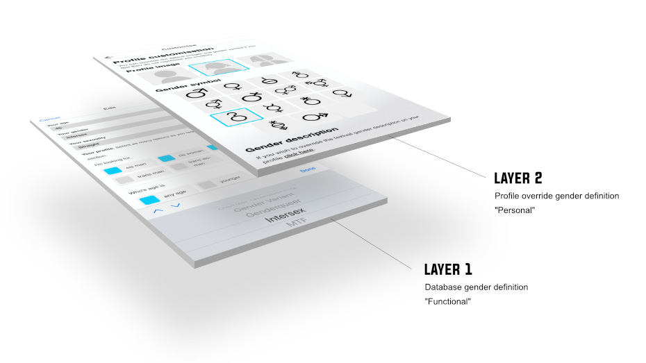
The solution was to create gender identities on two layers. The first being a more clinical definition 'functional', which is adopted by most sites. The second was a more 'personal' approach of overriding the profile display however its owner felt was correct. This approach keeps the search system simple and ensures a profile is representative and sensitive.
How does it work
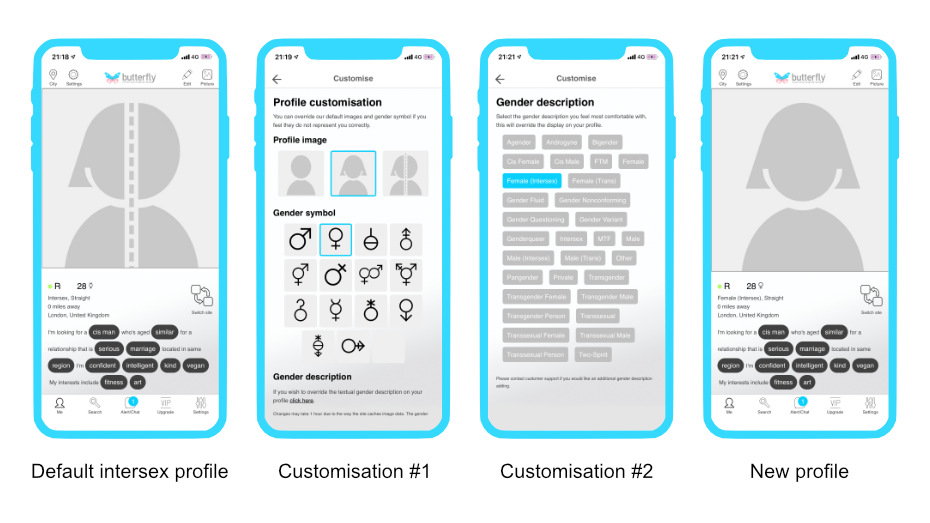
Once a member has set their gender the app applies is defaults, in R’s case she sets her gender as Intersex. Her profile states, Intersex with a mercury symbol ☿ and a blank profile picture depicted by a half female, half male image. From the settings menu she can now customise her profile in three ways:
Custom default photo: R is free to choose a male, female or transgender person image. She selects female.
Custom symbol: She selects ♀, the Venus symbol.
Custom gender description: Finally she opts for Female (Intersex)

R now has a profile that portrays her female identity and is not forced into selecting an incorrect gender indentity.